


Forms are an essential part of any digital product, as users, if we want to enjoy a service or purchase a product online, we must fill out certain important information that could be tedious if it takes too long to fill, so user retention turns into an obligation.
This can be a problem for the business; when the user doesn’t have a good experience filling out a form, they end up abandoning the process, which negatively impacts our conversion rate. Abandonment of the registration or checkout process reduces the conversion rate, which can directly affect revenue or monetization opportunities.
So, it’s important to analyze and identify areas for improvement to offer a good experience to our users when filling out forms. Below, we’ll see recommendations and aspects to consider improving our existing forms or if we need to design one from scratch.
Of course, they won’t always work the same for every site, but implementing these practices that have already been tested will be very helpful in optimizing the UX of our form designs.
Practices for Designing Effective Forms
Third-Party Validations to Forms
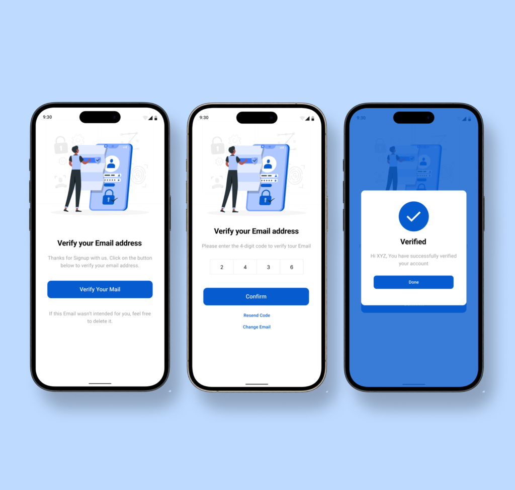
Sometimes we need to request third-party confirmation in a form (for example, email confirmation, phone number, or document confirmation), it’s important to consider some aspects to offer a good experience:
- Ensure that the instructions are clear on how the user should proceed to successfully complete the confirmation.
- Be transparent; explain why confirmation is necessary and how the information provided will be used.
- Design the process as simply and clearly as possible; try to minimize the number of steps and required information.
- Provide immediate feedback; confirm whether the confirmation was successful or if there is any problem that requires attention.
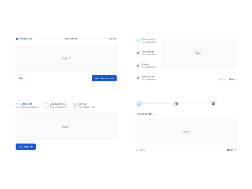
Multi-Step Forms
Dividing the form into multiple steps is a good practice, it helps to simplify the process and make it more user-friendly. Some recommendations to optimize the UX in this case are:
- Show clearly which step of the process the user is on and how many steps are left to complete. Uses the number of steps and the exact completion percentage.
- Group related information and divide the form into steps that are coherent and follow a logical sequence.
- Save progress automatically, allow users to come back later, and complete the process in multiple sessions if necessary.
- Provide immediate and real-time feedback; indicate if there is any error or field that requires attention so they can correct it immediately, ensure data validity also on each step.
- Provide a summary and the ability to edit the information before it is submitted, and the process is finalized.
- Maintain a consistent design and consistent visual aspects such as colors, typography, and styles at each step.
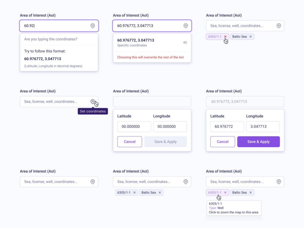
Autocompletion filling in Forms
Help the user autocomplete the form either with locally stored data or by fetching information from other parameters. For example, we could autocomplete the postal code by the address previously entered. Here are some aspects to consider in these cases:
- Manage the change carefully and smoothly to offer a more positive experience.
- Make sure to provide the option to manually delete or edit the automatically filled information.
Hints, Guides, and Error States in Forms
Implementing hints, guides, or error states for each field significantly improves the user experience. Some recommendations to optimize the UX in this scenario are:
- Use descriptive labels and relevant examples to help users understand what is expected in the field to fill.
- Use distinctive visual elements, such as colors or icons, to highlight hints or guides and ensure they understand which field they belong to.
- Show field states in real-time so if it’s incorrect, it can be corrected immediately.
- Highlight the field that requires attention; change the border color or other styles and show a descriptive icon and a text that clearly specifies what is happening.
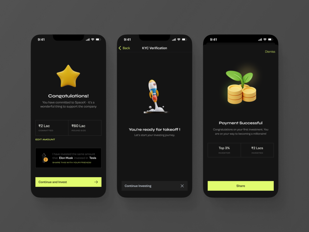
Success States in Forms
Displaying a success message and gratitude after a user has completed a form is an excellent way to end the user experience positively and encourage future participation. Here are some recommendations to optimize the UX in this scenario:
- Provide visual elements that indicate that the form was successfully filled.
- Use friendly and appropriate language to express your appreciation for the user’s participation.
- If relevant, provide additional information about what will happen next after completing the form.
- Offer clear action options for the user after completing the form.
- Ensure that the design of this step is consistent with the brand and visual identity of the site.
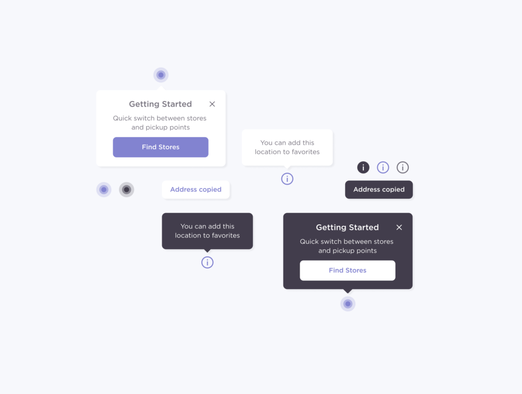
Adding Micro-interactions to Forms
The goal of micro-interactions is to make the interface attractive, and smooth, furthermore, to help to understand the field. Here are some recommendations to optimize the UX by adding micro-interactions to a form:
- Show smooth animations or color changes when the field is active or when it is completed correctly.
- Incorporate micro-interactions to create smooth transitions between different states of the form, such as moving from one step to another.
- Display pop-up messages or tooltips with useful information when users click on a help icon.
- Ensure that micro-interactions are responsive and optimized for mobile devices.
Additional Recommendations to Forms
Automatic Pilot Mode: Ensure that the system retrieves details with the fewest possible clicks, and the more automated, the better, for example, an OTP (One-Time Password) can be instantly retrieved from a text message, fill in the field, and validate it quickly all automatically, avoiding over efforts or distractions by having to switch to another app.
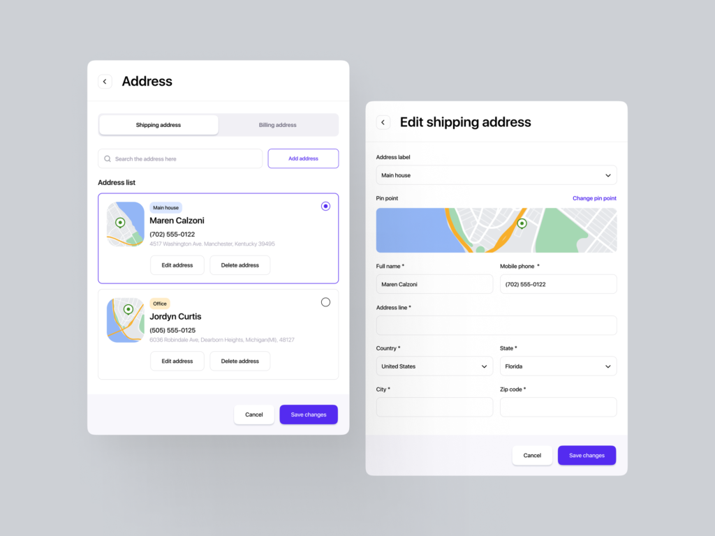
Location Fetching: When we need to fill in location information, we can use a visual map and allow the user to indicate exactly the location to then be automatically filled in the corresponding fields.
Conclusion:
A well-designed UX not only enhances user satisfaction but can also have a significant impact on conversions and the overall success of our digital product. Furthermore, to ensure that we are maximizing the potential of our forms, it is crucial to conduct continuous testing and refinements. Tools like A/B testing allow us to compare different versions of a form and determine which changes lead to better results. By conducting our own tests, we can identify specific areas for improvement and tailor our designs to meet the needs and preferences of our users optimally.
Ultimately, by investing in a solid UX and conducting regular testing, we can ensure that our forms are not only functional but also provide exceptional experiences that drive the success of our digital product.